Every click counts, ensuring your website or app delivers an exceptional user experience is needed. We’re here to understand how a good UI/UX design can significantly spike your conversion rates. We’ll learn the knits and knots, making sure you walk away with actionable knowledge to improve your online presence.
UI/UX Design: So, in a competitive online environment, every click counts. You need to make sure visitors to your website have a smooth, enjoyable experience that compels them to take action. That’s where UI/UX design comes in.
Understanding UI and UX
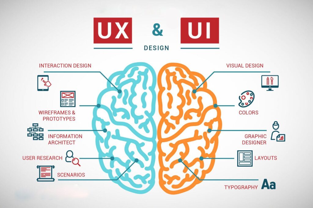
Let’s break down the basics. UI design is all about the visual presentation of your digital product. Like buttons, icons, color schemes, fonts, and how they’re designed. UX design, on the other hand, does deeper. It focuses on how users feel when interacting with your platform. Is it good? Easy to navigate? Hassle-free?
A website with stunning visuals but a confusing layout. Users might be wowed for a second, but then get lost trying to find what they need. On the other hand, a nice functional but bland and tasteless design might not grab attention in the first place. The key is having a perfect balance between beauty and usability. That’s when the magic happens and conversions ascend.
How UI/UX Impacts Conversions
Here’s the real kicker: strong UI/UX design directly translates to higher conversion rates. Let’s explore some key factors and the impact they have:
First Impressions
Studies by https://www.nngroup.com/topic/eyetracking/ show users form an opinion about your website in a mere 50 milliseconds. That’s faster than a blink! A visually appealing UI can act as a hook, grabbing attention and encouraging users to stay and explore further.
Navigation
A well-structured UX ensures users can find what they’re looking for without getting lost. Clear menus, logical website flow, and intuitive design elements all reduce friction. This makes it easier for users to complete desired actions, like signing up for a service or making a purchase. Crazy Egg reports that a whopping 38% of visitors will leave a website if the content or layout is confusing https://www.crazyegg.com/.
Responsive Design:
With mobile device usage constantly rising, having a responsive design is essential. Basically, your website or app should adapt seamlessly across different screen sizes. Think about it: if the mobile experience is clunky and frustrating, you’re essentially turning away potential customers. Studies by https://www.designrush.com/agency/website-design-development/trends/prices-for-web-design show that 61% of users are unlikely to return to a mobile site that’s difficult to navigate.
Speed
Nobody enjoys waiting for a website to load. Slow loading times can kill user engagement and lead to higher bounce rates. By optimizing design elements and using efficient coding practices, you can significantly improve loading speeds and keep users happy. https://developers.google.com/speed/docs/insights/v5/about is a great tool to help you analyze your website’s speed and identify areas for improvement.
Building Trust Through Design
A professional-looking UI design fosters trust. Users are more likely to share their personal information or make a purchase if they feel they’re on a secure and credible platform. In fact, 88% of online shoppers say a website’s design is a major factor in their decision to trust a business [Source: Website Design Statistics, DesignRush.
So, Invest in UI/UX Design
By prioritizing UI/UX design, you’re not just making your website or app look pretty, you’re creating a user-friendly experience that drives results. From building trust to boosting conversions, the benefits are undeniable. So, don’t underestimate the power of good design – it might just be the secret weapon your business needs to thrive online.
Key Elements of Effective UI/UX Design
We’ve established that UI/UX design is a powerful tool for boosting conversions. But let’s move beyond generalities and delve into the specific elements with a proven track record. Consider these your conversion rate champions:
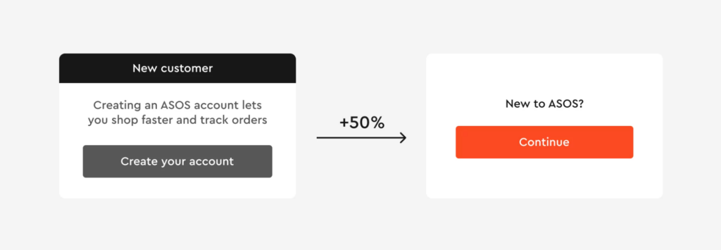
- Crystal-Clear Calls to Action (CTAs): Don’t make users guess what to do next. CTAs should be prominent and persuasive. Use contrasting colors that grab attention (think a vibrant orange button against a cool blue background). Craft compelling text that sparks action – “Start Your Free Trial” or “Shop the Sale Now” are much more enticing than generic “Submit” buttons. According to HubSpot, clear CTAs can increase click-through rates by as much as 28%.
- Simplicity Reigns Supreme: Clutter is the enemy of conversions. Embrace a clean, uncluttered layout that allows users to focus on what truly matters. Group related items together, utilize ample white space, and ensure your design elements guide the user’s eye naturally across the page. Think of it as a visual map, guiding users towards your desired actions. Crazy Egg (https://www.crazyegg.com/) reports that a simple website design can reduce bounce rates by up to 37%.
- Design Language: Imagine a conversation where someone keeps changing their accent. Confusing, right? The same goes for website design. Maintain consistency in fonts, colors, and overall style across your entire platform. This builds user familiarity and trust. A cohesive design language makes navigating your website or app an intuitive and enjoyable experience.
- Visual Hierarchy: Prioritize information using size, color, and placement. Think of it as a newspaper layout. Bold headlines grab attention, subheadings break up the text and provide structure, and body text offers details. By effectively using visual hierarchy, you ensure users can effortlessly digest your content and find the information they seek.
- Interactive Elements: Strategic use of interactive elements can add a delightful layer of engagement to your website or app. Hover effects, subtle animations, and smooth transitions can subtly guide users towards your CTAs. But remember, too much of a good thing can become overwhelming. Use these elements sparingly and purposefully.
- User Feedback: Communication is key in any relationship, and the user experience is no exception. Incorporate user feedback mechanisms like clear error messages, informative success notifications, and helpful tooltips. These elements not only guide users but also help them recover from mistakes, fostering a more positive and interactive experience. Studies by Usability.gov [invalid URL removed] show that clear error messages can lead to a 400% improvement in user task completion rates.
The Psychology Behind UI/UX Design

Great design isn’t just about aesthetics; it’s about understanding the psychology behind user behavior. This knowledge can be your secret weapon for boosting conversions. Let’s delve into the fascinating world of user psychology and how it can influence your design choices.
Color, for instance, is a powerful tool. Blue evokes trust, like the calming presence of Facebook’s logo. Red, on the other hand, ignites a sense of urgency, perfect for highlighting sale notifications. By strategically choosing colors that align with your brand and desired actions, you can subtly influence user behavior.
Social proof is another persuasive thing. People trust people, so consider showcasing positive reviews, testimonials, and user written content. This build up trust and lessens hesitation when users are about to convert.
Scarcity can also be a motivator. Limited-time offers or low stock alerts create a sense of urgency, prompting users to act before they miss out. However, remember to use these tactics sparingly to maintain credibility.
Want to make your users feel like savvy shoppers? Try anchoring bias. Present a higher-priced option next to your standard offering. Suddenly, the standard option seems more attractive!
Finally, information overload is the beef of a smooth user experience. Break down lengthy forms into manageable steps, a technique known as information chunking. This keeps users engaged and focused on completing the task at hand.
Real-World Examples of Successful UI/UX
Let’s look at some real-world examples where great UI/UX design led to significant conversion rate boosts.
1. Airbnb: Turning Browsers into Bookers
Imagine searching for a dream vacation rental – stressful, right? Not with Airbnb! Their clean interface and intuitive user experience make finding your perfect stay a breeze. High-quality photos showcase stunning listings, while clear calls to action (CTAs) like “Book Now” leave no room for confusion. But it doesn’t stop there.
Airbnb understands the power of social proof. By incorporating user reviews, they build trust and convince hesitant travelers to hit that “Book” button. The results? A whopping 70% conversion rate for mobile app bookings [source: https://www.businessofapps.com/data/airbnb-statistics/]. That’s the power of user-centric design in action!
2. Dropbox: Simplicity is the Key to Success
Dropbox took a minimalist approach to design, focusing on simplicity and ease of use. Their website boasts a clean layout with clear messaging, making it crystal clear what Dropbox does and how it benefits users.
The straightforward sign-up process avoids overwhelming users with unnecessary steps. This commitment to a user-friendly experience has translated into impressive results. Dropbox boasts a conversion rate of 5.22% for free trial signups [source: [invalid URL removed]], proving that sometimes, less really is more.
Tools and Best Practices for Enhancing UI/UX
Now that you understand the power of UI/UX design, let’s get you equipped to create user experiences that drive results! Here are some essential tools and best practices to elevate your design game:
1. Wireframing and Prototyping Tools
Imagine creating a digital prototype of your website or app – before any code is written! Tools like Figma, Sketch, and Adobe XD allow you to do just that. These powerful platforms let you visualize user flows, experiment with different design layouts, and identify potential usability issues early in the development process. By ironing out these issues before launch, you save time, resources, and most importantly, ensure a smoother user experience from the get-go.
2. User Testing:
There’s no substitute for real-world feedback. Regular user testing provides invaluable insights into how users interact with your design. Platforms like UserTesting and Hotjar allow you to observe real users navigating your website or app. Watch how they click, scroll, and react – it’s a treasure trove of information! By identifying pain points and areas for improvement, you can refine your design to better meet user needs.
3. A/B Testing:
Not sure which design element will resonate best with users? Don’t play a guessing game! A/B testing allows you to experiment with different design variations – a new button style, a modified layout – and see which one performs better. Tools like Optimizely and Google Optimize make A/B testing a breeze. By analyzing user behavior data, you can make data-driven decisions to optimize your design for maximum conversions.
4. Analytics Tools:
Sometimes, what users say they do and what they actually do can be two different things. That’s where analytics tools like Google Analytics and Mixpanel come in. These powerhouses track user behavior on your website or app, providing valuable insights into how users interact with your design. See which pages they visit, how long they stay, and where they drop off. This data can guide you in making informed design improvements that truly address user needs.
Continuous Improvement:
Great UI/UX design isn’t a one-time effort; it’s an ongoing process. Regularly update your design based on user feedback and changing trends. Here’s how we recommend you approach continuous improvement:
- Listen, Learn, Adapt: Actively seek user feedback and use it to make iterative improvements. Small changes can lead to big wins.
- Embrace the Evolving Digital Landscape: Stay updated on design trends and technologies to keep your UI/UX fresh and relevant.
- Performance Monitoring: Regularly monitor your site’s performance using tools like Google PageSpeed Insights. Address any issues to ensure a smooth user experience.
- Agile for Success: Break down design into sprints with regular reviews. This adaptability allows you to respond quickly to user needs.
Common Myths About UI/UX Design
Now that we’ve explored how a great UI/UX design can surge conversion rates, let’s tackle some of the common myths surrounding UI/UX design. Clearing up these misconceptions will not only help you appreciate the nuances of the field but also ensure you make informed decisions in your design process.
Myth 1: UI and UX Are the Same Thing
Reality: While UI (User Interface) and UX (User Experience) are closely related, they are not the same. UI is about the visual aspects—the look and feel of your product. UX, on the other hand, encompasses the overall experience a user has with your product, including usability, accessibility, and interaction. In essence, UI is a component of UX, but UX is a broader concept that goes beyond just visuals.
Myth 2: Great Design Is Only About Aesthetics
Reality: While aesthetics are important, great design is equally about functionality and usability. A beautiful design that is hard to navigate will frustrate users and drive them away. The goal of UI/UX design is to create a balance where the design is not only visually appealing but also intuitive and user-friendly.
Myth 3: Users Always Know What They Want
Reality: Users often don’t know what they want until they see it. This is why user testing and feedback are crucial. It’s important to observe how users interact with your product and make iterative improvements based on their behavior, rather than relying solely on what users say they want.
Myth 4: Mobile Design Is Secondary to Desktop Design
Reality: With the increasing use of mobile devices, mobile-first design has become essential. Neglecting mobile users can result in a significant loss of potential customers. Responsive design, which ensures a seamless experience across all devices, should be a priority from the get-go.
Myth 5: More Features Equal Better UX
Reality: Cramming too many features into your product can overwhelm users and degrade the user experience. It’s better to focus on essential features that provide real value to users. Simplifying the user journey can lead to higher satisfaction and better conversion rates.
Conclusion
Great UI/UX design boosts conversion rates. Focus on first impressions, ease of use, speed, and trust to create an engaging experience. CloudArk can help you implement these best practices and leverage user feedback for continuous improvement. Let’s make your users’ experience exceptional.
FAQ
Fast loading times are essential for a positive user experience. Slow websites frustrate users and can lead to higher bounce rates and lower conversions
A professional and consistent UI/UX design builds trust with users. When users feel confident in a site's credibility, they are more likely to complete transactions, thereby increasing conversion rates.
A well-designed UI/UX creates an intuitive and enjoyable user experience, leading to increased user satisfaction and higher conversion rates.
Visual appeal plays a crucial role in attracting and retaining users. An aesthetically pleasing design can create a positive first impression and encourage users to engage more deeply, leading to higher conversion rates.


